Chong Office
Location:
Melbourne, AUS
Year:
2021
Core Service:
- Implement
- Create
Client:
Chong Office
Designers:
Casey Chong
Katie Fridman
Dalton Bruyns
Chong Office is the artist practice of Casey Chong. Working closely with material, aesthetics and the senses to bring together eccentric yet functional artworks that border furniture, sculptures and crafted objects. As a brand, Chong Office embraces the ambiguity and contradiction throughout creative processes and refuses to be categorised by style or identity. For this, Chong Office is both predictable and unpredictable.
Chong Office is the multi-faceted practice of artist Casey Chong. She works closely with material, aesthetics and the senses to bring together eccentric yet functional artworks that border furniture, sculptures and crafted objects.
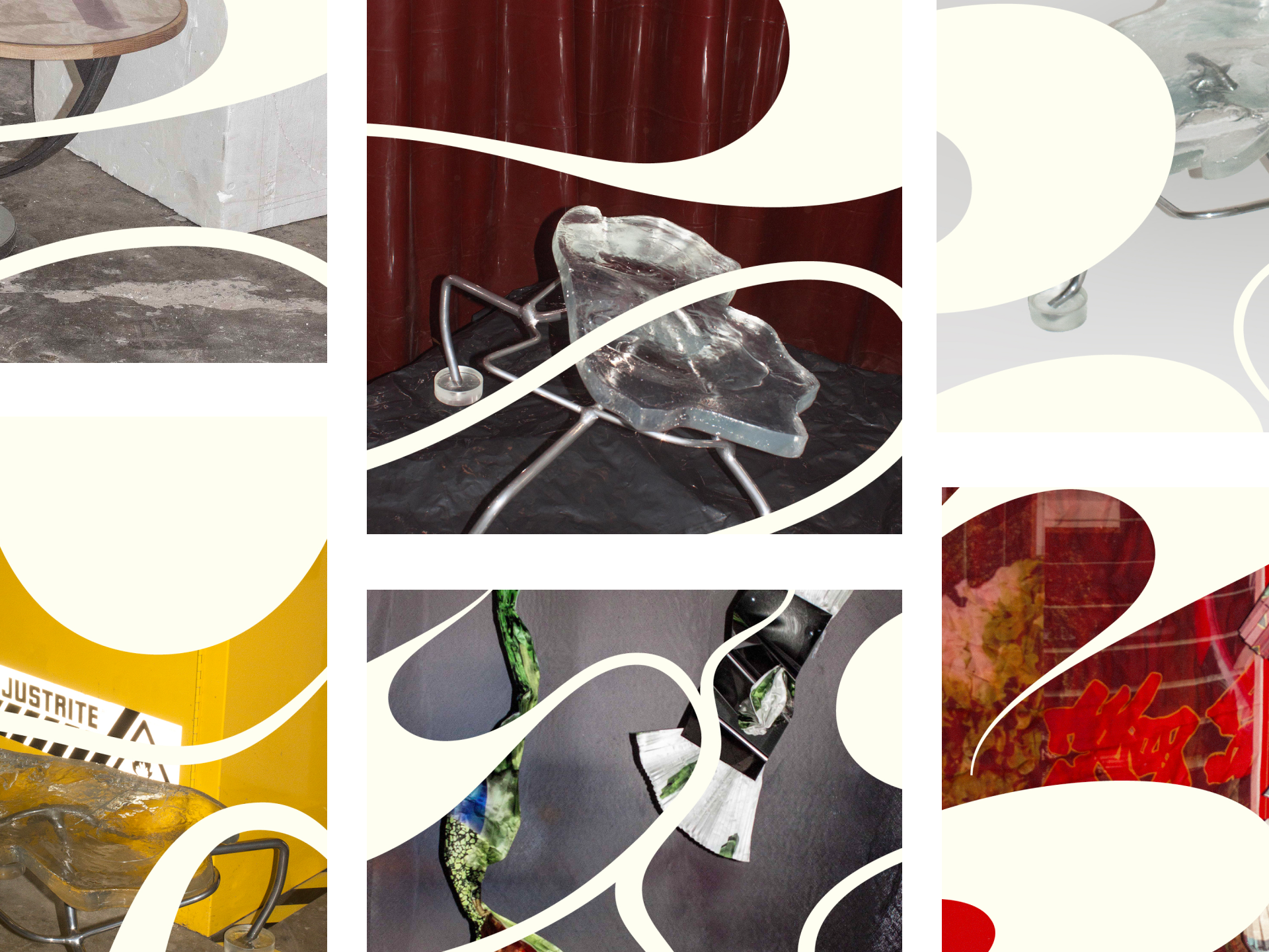
Chong Office embraces ambiguity and contradiction throughout creative processes and refuses to be categorised by a single style or identity. Her featured pieces include ‘the Collapsed Stool’ and a biomorphic vase titled ‘Pop Pop’.
Chong Office builds upon the realm of possibility in functional art with an aesthetic that is classic in approach with a twist of eccentricity. We wanted to capture this in our branding and strategy for Chong office, taking a neutral stance to ensure we do not detract the attention and energy from Chong’s perspectives of her art. We also wanted to capture Chong’s passion for her craft by intertwining her personal interactions and experiences with her creative process into the branding.
“To me [sic] a piece of ‘furniture’ is always related to the human interactions, the personal experience and emotions attached to it”
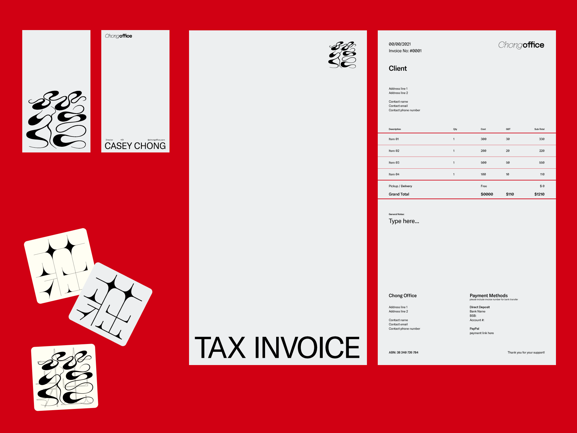
Studio TunTun developed a layered identity that embraces the contradictions within Chong Office.
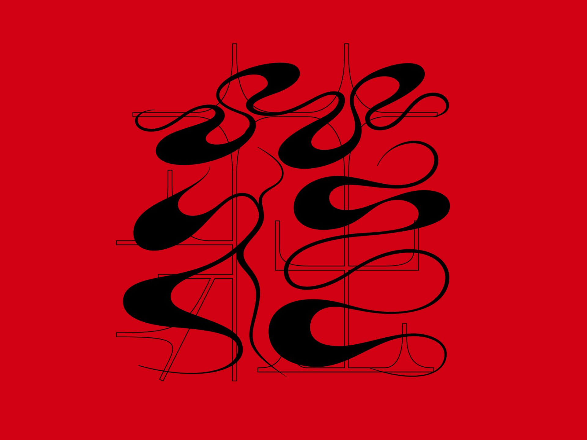
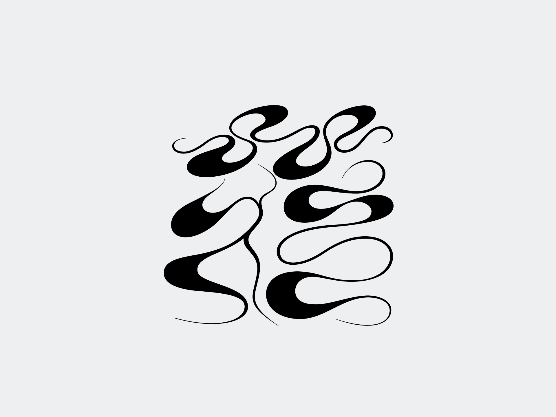
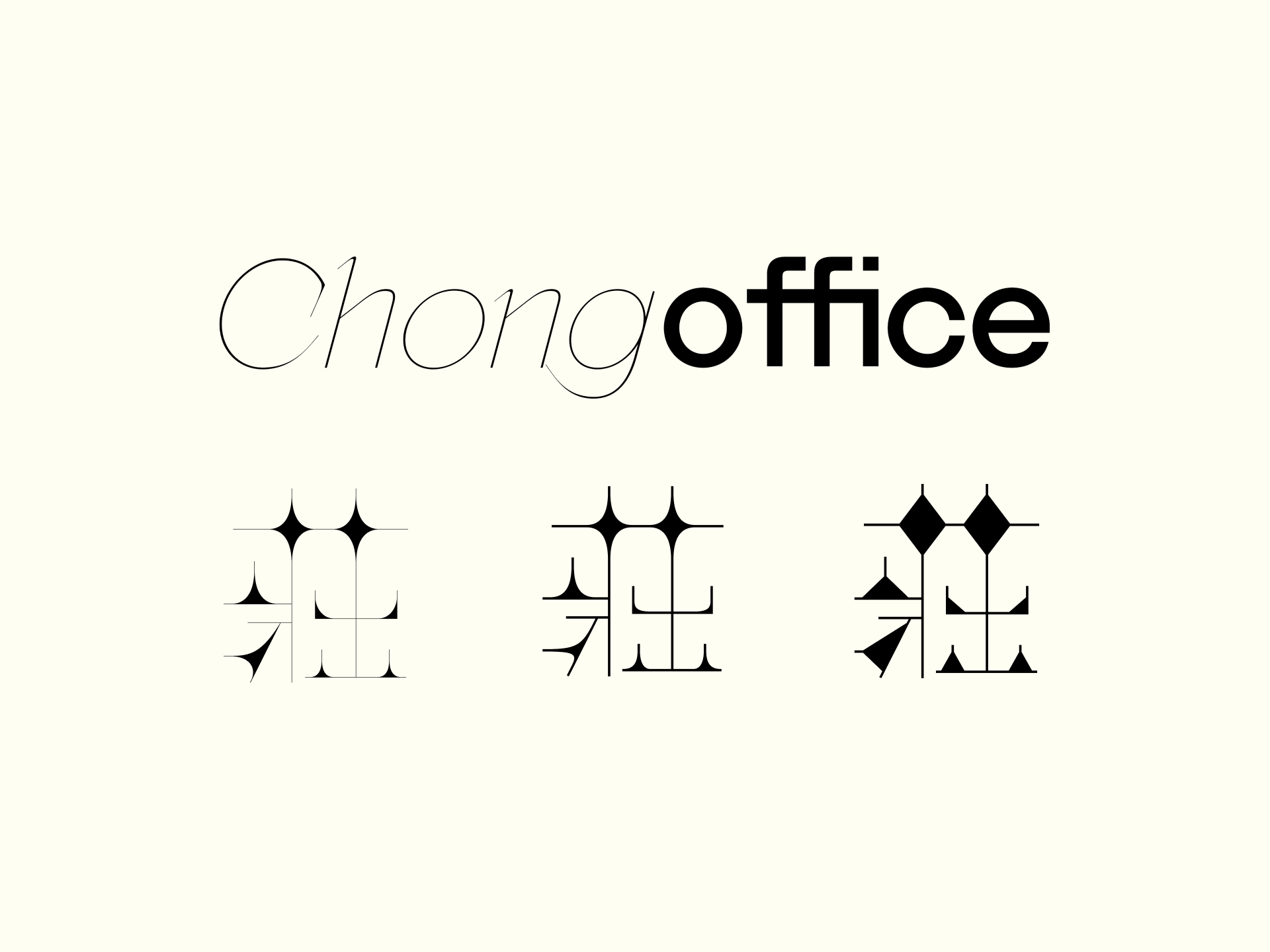
Six typographic logomarks in both latin and traditional Chinese scripts underpin the brand, with the logo being a vivacious interpretation of Chong’s family name in Chinese character [ 莊] (the top part of the character means ’grass‘ whilst the bottom half represents ‘strong’). This typography translates to the expressive nature of Chong Office’s forms into a system that seamlessly flows from digital to print with artist seals applied to each physical piece.
The colour palette is purposely small and subtle with a cold grey with a tint of blue to evoke materiality. The rich black represents confidence in application and the cream white acts as the gentle overlay that is delicate and articulate.
We’ve been elated to see the Chong Office brand expand and begin to gain traction within the local market. Through challenging different norms and approaches, Chong Office has continued to explore, develop and strengthen their place in furniture making both in Australia and Hong Kong.
